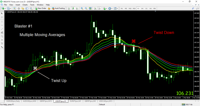
By adding moving averages to a price bar or candlestick chart, the direction of the trend quickly becomes obvious. This is true whether you are swing trading on a daily chart or using a 5 minute or 500 tick bar time frame for scalping. Once the lines are in place, moving average crossovers are a handy way to steer clear of chop and consolidation — or to identify the beginning of a real trend reversal.
I first came upon the notion of using multiple moving averages (MMA) when reading the work of Daryl Guppy, a long time technical analyst and industry thought leader from Australia. Creating clusters of moving averages of various time lengths doesn’t really change anything about price movement, but I have found that using MMA visually emphasizes the direction of the trend. This is especially helpful to me when trying to interpret price pullbacks. Are they temporary, counter-trend moves or more important reversals?
By combining MMA on my charts with a few additional, widely recognized indicators, I have developed a method for finding entries that “make sense.” By this I mean first and foremost that you are trading with the trend. Second, you are also waiting for a pullback to give you an optimum entry with the least amount of risk. It is absolutely true that using too many indicators makes the chart confusing. Nevertheless, MMA combined with a “Chandelier,” MACD, and Stochastics have helped me to achieve profitable results. I will explain about each of the indicators and the settings I have chosen, as well as how to interpret the chart patterns as we continue. But first, let’s just take a quick look at MMAs and a crossover on a sample chart.

First of all, please notice the medallion symbols on this one hour price chart of the USD and JPY (dollar/yen). The moving average lines on the chart range from an 8 EMA (yellow) to a 24 EMA (red). I have programmed the medallion to appear when the shorter 8 period line crosses up through the 24 EMA. The red medallion shows the reverse – when the 8 crosses down over the 24. Of course, it is possible to simply observe when the crossover takes place, but I have found it convenient to see the medallions, especially when looking back over previous time periods to back test and confirm that a crossover indicates a change in trend.
Once the lines are “stacked,” either in an up or down direction, it is easy to visualize that a trend is in place. Typically, there will be pullbacks into these moving average bands as trends move in waves. Because the bands represent resistance to these counter-trend moves, the price action often resembles a sling shot. There is compression of the moving averages as price reverts to the mean, and then, often an explosive move higher or lower — in the direction of the primary trend.
Finally, using the bands helps tremendously in knowing where to place your stop loss. Once a pullback occurs, given the notion of higher highs and higher lows, if the trend is strong, we do not want to break below the previous low in an uptrend or the previous pullback high in a downtrend.
There are a number of videos on our Youtube channel that provide more examples this important principle. Click below to be connected. And please share your email and subscribe to our channel for new video postings! And now, FxFortuneHunters — Let’s get some pips!


